The quest to create a logo was a thrilling part of our journey. Logos are often the first things that catch our eyes when we visit a homepage. A logo influences the image that potential customers develop about the brand. We therefore wanted a logo that immediately reflects the identity of our business. Naturally, we felt a little nervous, also because none of us two is incredibly skilled in graphic design.
We already developed some ideas about the logo during our previous quest to find a suitable name (The name quest). The problem was that neither of us had a clue about how to turn those ideas into a badass logo. Luckily, we weren't alone on our quest. This blog is dedicated to our friend Joni who helped us creating this:

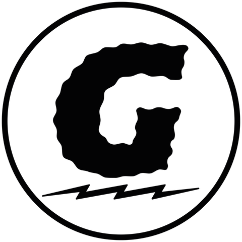
The logo includes some details and hidden meanings, as Joni explains:
“When I got the mood board for the logo, I immediately knew this is my cup of tea and a great opportunity to hook up my boys with my knowledge and skills. I wanted people to see right away what this company is all about. The logo's aesthetics come are inspired by the main elements of gravel riding: strong, hard, rough, bumpy, and uneven. The mirrored E represents the punk attitude, and it's also illustrating a forward-pointing arrow. Flashes are always a cool thing, and I like to use them on my artwork, but the one here has a deeper meaning. The meaning of the flash underneath the text illustrates the endless ascents and fast going descents which gravel riding is also about ... and it's also there to give the logo more attitude. :D"
So who is this 'Joni'-guy, where does he come from, and how did he come up with our logo?
Joni is a passionate cyclist and graphic design student at the University of Lahti (a small town close to Helsinki in Finland). How I met him is a maybe not-so-typical story of getting to know people in a new city. As I wrote in our story, I moved to Finland some years ago. It was during one of my first bike rides here that I met Joni. The snow still covered the roads and paths on that day. We ran (or should I say 'drove'?) into each other and started talking. At some point, I pulled out a burrito to which Joni replied, "Do you also watch Dustin Klein?" Yeah, Dustin Klein sealed the deal of our friendship. Since that day, he's my go-to guy for any bike ride and pretty much the guy I'm spending most hours on the road with.

We asked Joni to design our logo because me and Thomas both love his drawing style (see for yourself). We didn't want to limit his creativity early on and only provided the following specifications to get him going:
"We're looking for either a wordmark or a combination mark (wordmark + pictorial or abstract mark); not sure if we want a mascot? - Primary logo, suitable for round placement (for example, Instagram profile, etc.) - Maybe secondary logo, suitable as webpage banner or letterhead - Name: GREPP (not necessarily all-caps, might also be all small letters, depending on what you think works better with the design)"
We also sent him a list of terms we want people to associate with our brand: 'natural elements'; 'gravel riding'; 'robustness'; 'sustainable'; 'punk; and last but not least, 'No-Spandex.'
After a couple of weeks, he shared the first draft. It took us a bit of back and forth, as you can see in the below versions. Similar to how it went with our name, we ended up with a version that is very close to the first draft!
![]()
Overall it was a great experience, and we couldn't be happier about the result—big shout out to Joni for helping us!
Give Joni a follow on Instagram and stay tuned.
Ride save.
Cheers, Jan